

TheLowKing
Really Really Experienced
...I don't like it.
There's soooo much whitespace I'm wearing out my scroll wheel:
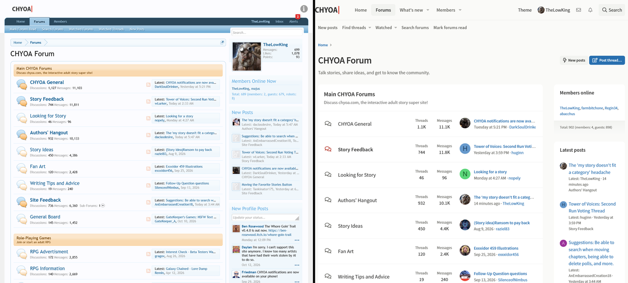
The entire front page went from 2 screenfulls to 4. Profile posts are 3/4 of the way down the page, where previously it was already partially visible on page load (for me on my screen, mileage may vary). Latest posts and trending content serve similar purposes. The white theme is too white (all the soft accents gone, and there's almost zero colour outside of avatars and (most but not all!) links). But the black theme is too black too (consisting almost entirely of white text on shades of dark grey). Text is too large (and I'm reaching an age at which I'm surprised to be saying that). The 'thread has unread posts' indicator is gone ('forum has unread threads' still works).
I'm trying really hard not to be entirely negative, but I'm having a hard time identifying things I like. The only thing I can think of is that the 'preview' function is now also available when using the quick post box, rather than only the full-page one. For obsessive rewriters like myself, that's a nice little convenience.
There's soooo much whitespace I'm wearing out my scroll wheel:
The entire front page went from 2 screenfulls to 4. Profile posts are 3/4 of the way down the page, where previously it was already partially visible on page load (for me on my screen, mileage may vary). Latest posts and trending content serve similar purposes. The white theme is too white (all the soft accents gone, and there's almost zero colour outside of avatars and (most but not all!) links). But the black theme is too black too (consisting almost entirely of white text on shades of dark grey). Text is too large (and I'm reaching an age at which I'm surprised to be saying that). The 'thread has unread posts' indicator is gone ('forum has unread threads' still works).
I'm trying really hard not to be entirely negative, but I'm having a hard time identifying things I like. The only thing I can think of is that the 'preview' function is now also available when using the quick post box, rather than only the full-page one. For obsessive rewriters like myself, that's a nice little convenience.

